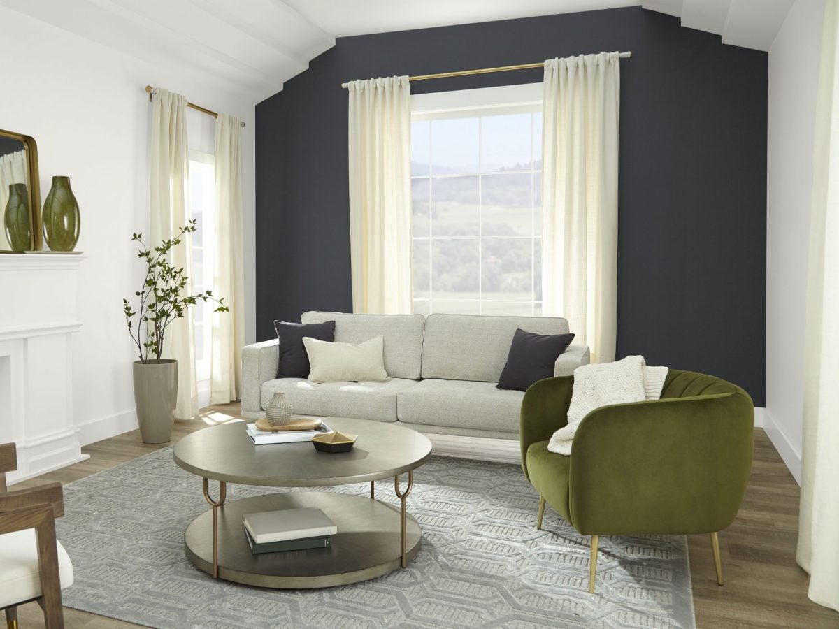
We’ve seen terms like soft life and quiet luxury circulate on social media all year. While those phrases can be designated for lifestyle choices mainly in health, wellness, and fashion realms, they can also translate to the interior design landscape. A recent survey commissioned by Behr Paint Company found that more than (52%) of Americans say painting a wall/walls a darker color makes the room feel more luxurious, proving the point that all generations are opting for an illusion of a bit more luxury in their lives nowadays, even if the price tag doesn’t reflect it.
Behr tapped into their consumer’s desires and launched their 2024 Color of the Year, a timeless, modern hue designed to awaken the senses and exude confidence in and outside your home, Cracked Pepper (PPU18-01). “As we look into 2024, creating a sense of comfort and belonging will continue to drive design decisions—but now, as life returns to its more familiar rhythms, it’s time to allow our senses to come alive,” says Erika Woelfel, Vice President of Color and Creative Services at Behr Paint Company. “From heightening the aromas of a dining room to feeling the softness of a living area, Cracked Pepper enhances the natural expression in any space.”
The color was made to feel accessible, grounded, and versatile, perfect for interior design novices, professionals, and DIYers to leverage for home projects or commissions. “We are pleased to release this versatile, soft black into the world. It is a color that projects great quiet confidence. It’s a sophisticated color and awakens the senses. It elevates the way you feel in a room,” Woelfel says to ESSENCE.
She also spoke about how lifestyle trends inform their decision to move forward with the 2024 color, underscoring the importance of quiet confidence. “So, as we look at some of those lifestyle trends happening this year, and looking out to 2024, we see the idea of understated luxury, quiet confidence, and a connection with nature,” Woelfel states.
Behr’s approach with the Cracked Pepper color was to provide a solution for their consumers. “So as we talk about color and how people are approaching their homes, we felt that Cracked Pepper was the perfect place for people to look for a new color that updates the spaces that they’re in, coordinates with other colors, finishes, materials in their home works with any decor style,” Woelfel states.
Selecting a marquee color for the upcoming year is a collaborative process, aside from looking at lifestyle trends and conducting survey research. Woelfel revealed that Behr partners with The Home Depot to curate color palettes, specifically aligning on the Color of the Year with a trusted design expert, Sarah Fishburne, the Director of Trend & Design and Industrial Design at The Home Depot.
Fishburne weighed in on the color choice, “It was important for us to find a color that’s easy to understand. [Cracked Pepper] can work in multiple applications. Sometimes, you know, color can be very room-specific and application specific. So this color is truly universal. It works inside and outside; it’s that soft black. It’s all the design trends that you’re seeing the return of the traditionalist, the modern organic, the modern posy, the Art Deco revival; it really can span into all of that.”
She continues, “When we look at colors, we want to make sure it’s easy for the homeowner to connect with and use. It feels very specific.”
You’re also probably curious about how Woelfel and her team named the Color of the Year. We were, too, as it sounds so down to earth, approachable, testable, livable, and surprisingly fabulous. “So Cracked Pepper ” comes from our core color palette. We’ve had it in our color system for many years, but we arrived here again because we feel that this soft black is an easy and multi-sensory color,” she shares.
Woelfel adds, “When we think about being able to see touch, smell, taste, feel a color, Cracked Pepper hits on all five senses. You feel immersed in it, and it’s very charismatic. It’s just a very sensory color. The name also helps people visualize what the color is. And like we said, it’s approachable. It’s livable, and we can’t wait to see how folks start using it in their design or DIY projects.”
Although it’s a rich, decadent, and bold color, you can start small by thinking of ways to incorporate it into your household. Think of end tables or painting furniture or a planter outside. “The color is so fun because you can embrace it however you want,” Fishburne shared.
Woelfel said, “Cracked Pepper adds depth to a room and makes the space more expansive. So we’ve seen that in our vignettes. It’s the color’s magic and superpower.”
Cracked Pepper is part of BEHR’s Designer Collection, a go-to palette of 30 timeless neutrals and designer-curated hues that streamline the paint selection process, transforming ordinary home improvement projects into designer-quality makeovers, and it’s available exclusively at The Home Depot stores nationwide.


